Your basket is currently empty!
First thoughts on Twenty Twenty-Two and Full-Site Editing
WordPress 5.9 was launched a few weeks ago, and I was very eager to test full-site editing on my personal site. I loved the Eksell theme, but the desire to explore this massive change in the WordPress workflows was bigger.
Site editing is still in beta, which means that the WordPress core team is busy developing it. In this post, I hope to share some of my first experiences. Of course, I tested with the default Twenty Twenty-Two theme.
What I liked

Colour scheme. I LOVE the option to set a colour scheme for the whole website. It’s still not entirely clear why “default” and “custom” necessarily need to be there. But maybe I’ll discover that later.
Template editing. I started over a few times, but all-in-all I found the full-site editing a fairly enjoyable experience. I was able to create a grid post archive that only has features images and post titles. My site is pretty focused on my photography, and I’ve had a grid archive approach since 2015, which is the time I started blogging again. (I needed custom CSS to set this up when I used the Twenty Twenty theme.) In just 15 minutes, the archive template had a category description added in a column next to the category name, as well as the grid with just the post titles. You can see the result on the photography category.

I want to keep playing. I enjoy building websites. I’m not a developer, but I love playing with the layouts of websites. Of course, the content of a site is the most important part, but I’m a sucker for how the content is presented too. The ease of this is what got me into WordPress, and toying with Twenty Twenty-Two for just a few hours made me realise there is so much more to explore and test. The beautiful examples that lead developer (and colleague) Kjell added to his announcement post show that I’ve nowhere near reached the limits of the exploration.
What I’d want to rethink
Here are a few things that I would like to see differently.
Missing option for conditional logo. Twenty Twenty-Two comes with two large, dark header and one without. However, you cannot by default select the logo for each of these headers in a different shade. With the colour scheme I selected, the logo on the main header would ideally have a much darker shade for the back colour.

Missing option to duplicate templates. I wanted to play around with custom headers, but I can either add a new one (which is entirely empty) or customise an existing one. Having an option to duplicate an existing element would’ve been a great way to speed things up.

Images in post content. I appreciated that Eksell in the single post/page template uses the white-space for images that are left or right aligned. This is not the case with Twenty Twenty-Two. For example, in this post, I selected the first image to be right-aligned, but it doesn’t use the whitespace for that. That means that images take a lot of real-estate that could be found elsewhere. This is also in contrast with what you see when editing the page or post. For the About Me page, I’ve worked around that by working in two columns and setting the columns block to wide width, but it felt quite hacky. I’m not sure what the reasoning behind it is.

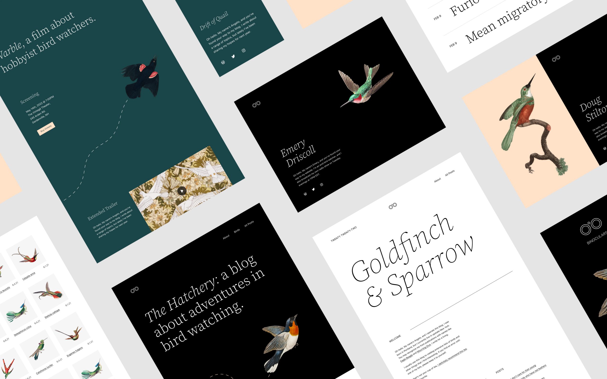
Gimmicky bird on home page. The bird on the homepage template is cool. It shows the possibilities of the theme and the colour shading, but I’m not a designer, and I’ve got absolutely no idea yet what I’m going to replace it with.
Closing thoughts
I listed more challenges than things I liked, but my overall feeling was great. This is just the start of full-site editing, and I cannot wait to see what the next few years bring.
Comments
2 responses to “First thoughts on Twenty Twenty-Two and Full-Site Editing”
-
Hi, thank you for your interesting review. I would love to use the theme on my personal blog (hosted on WordPress.com) when the first time I saw it available on the WPcom theme library.
However, I only tried it for around a half hour and change back to 2021 theme, because I had at least 3 problems.
First, I feel like there’s CSS delay (I don’t really know what it called), the transition from post to post, page to page, wasn’t smooth.
Next, the dropcap is not properly sized, it broken the sentances.
Last, the Cumulative Layout Shift is larger than older themes in library.
Actually I still one more problem which is I still not really used to use the FSE.
I hope the theme will be improved in the near future.
-
Hey @iqbal. Thanks for this input. The best you can do is to either use the WP.org forum for TT2 to leave these comments, or go to WordPress.org and log these on trac as issues.
-
Leave a Reply