Identity in design

For the fourth time in a decade, Belgium’s away shirt for a major tournament has been inspired by something typically Belgian.

While some of the design choices over the past decade have been pretty horrible (I’m looking at you, Guy Fieri-inspired home jersey), these four have all been creative designs.

Having not lived in Belgium for the entirety of that decade, I’ve also noticed that the ability to bring together my passion for our national football team with another part of our identity to be proud of has created a cohesive Belgian feeling and identity that we honestly, and given our complex history, have not always had much.

That said, here are all four of them. Which one is your favourite?

Light blue Belgium away shirt with a black, yellow and red band across the chest.
2016: inspired by road cycling, the sport that is as typical Belgian as it gets
White Belgium away shirt with multicoloured festival-style patterns on the collar, cuffs and side panels.
2022: inspired by Tomorrowland, showing Belgium’s rich music festival culture
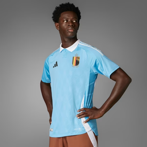
Model wearing a light blue Belgium away shirt with a white collar and a subtle tonal pattern.
2024: inspired by Tintin, probably still the most famous Belgian ever (the irony that he’s not real)
Model shouting with joy in a pale blue Belgium away shirt covered in soft pink and blue abstract shapes, against a bright blue background.
2026: inspired my René Magritte, one of the most famous artists in surrealism

And of course, in typical Belgian culture, ending with a brief reminder of how bad it got at its worst:

Laughing model in a red Belgium home shirt with black shoulders and orange flames along the sleeves.
2022: inspired by —, I honestly don’t know what they were thinking
1–2 minutes
202 words

Comments

3 responses to “Identity in design”

  1. Andrea Badgley avatar

    I like the Magritte one. Brian and I went to the Magritte museum when we were in Brussels and it’s was one of my favorite experiences from our whole trip. I think about it often.

    1. Job avatar

      Yeah, I think I’m with you. I also really liked the Tintin one, even though it was quite controversial to some. I found that they had made the good balance in having a clear connection without being too gimmicky.

  2. John Louis Mapel avatar
    John Louis Mapel

    The 2016 road cycling one is pretty classic/stylish! But I agree they did a good job this year with the Magritte one. 🙂

Leave a Reply

This site uses Akismet to reduce spam. Learn how your comment data is processed.